My name is Mario Louka and I am a media student at the Latymer School. My candidate number is 9099 and I am working with Eddie Rowe (9147) and Ignacio Flores (9049) collectively in group 2.
In order to view my work please click on the 3 labels named 'A2 Research + Planning', 'A2 Construction' and 'A2 Evaluation'.ick above to enter the website
A wide range of our inspiration came from other music videos but there were certainly some aspects that came from art, fashion and culture.
300 I like the greenscreen effect that was used in the movie, 300. The film was heavily stylised which looked particularly eye-catching and provided a great overall style to the film.
Minimalism
Minimalism is 'a movement in sculpture and painting which arose in the 1950s, characterized by the use of simple, massive forms.' It is certainly a concept that we are interested in as it looks really effective with a major focus pulling in the audiences eye.
I also like the look of minimalist fashion as it is quite plain but once again looks effective as long as striking colours or opposite colours are used.
Our artist has been heavily influenced by real life examples of similar artists. Looking into both DJs and singers has been very helpful at gathering a range of references that we can use to make our artist more realistic.
Calvin Harris
Appearance/Costume
The appearance of Calvin Harris has heavily influenced my thinking for the costume. I've found both artist mannerisms and costume similarities that I like and plan to use for our artist. Calvin Harris tends to mainly use plain clothes which I like. He also has quite a chilled, laid-back personality which is something else that I like.
Oliver Heldens
I like the personality of house artist, Oliver Heldens also. His cheeky personality means he's really well liked and he also tends to dance to his music on stage which is also another reason to like the artist.
The first website I researched was Calvin Harris' website (calvinharris.co.uk). As soon as you got onto the homepage, the first thing you could see was a brand new video at the centre of your screen. I feel this already offers interactive content as the first thing you do. The interactivity continues with the navigation bar. You have to click it to go in and out which not only looks sleek but also offers something to do.
His video page
His video page once again featured a huge video portal where you could watch his newest music videos. The style of the page was very much in keeping with the rest of the website which had a very sleek style to it yet still functional and informative. With a wide range of content too, his website is one of the better websites for artists that I've seen.
Disclosure
Disclosure's website (www.disclosureofficial.com) also had some great examples on it of what we could do. I liked the fact that they had an entry page prior to entering the main website as it gave an insight of what was on it.
Disclosure's entry page
Disclosure's gallery was also quite nice as it featured their Instagram feed showing synergy, something we aim to achieve. The way the photos are laid out also looks visually appealing like small polaroids.
Finally, I really liked Disclosure's store, it featured a range of branded merchandise along with standard and limited edition albums. I like how they have albums as the first items for sale as this is more likely to be seen first. This is something we will try and do on our website.
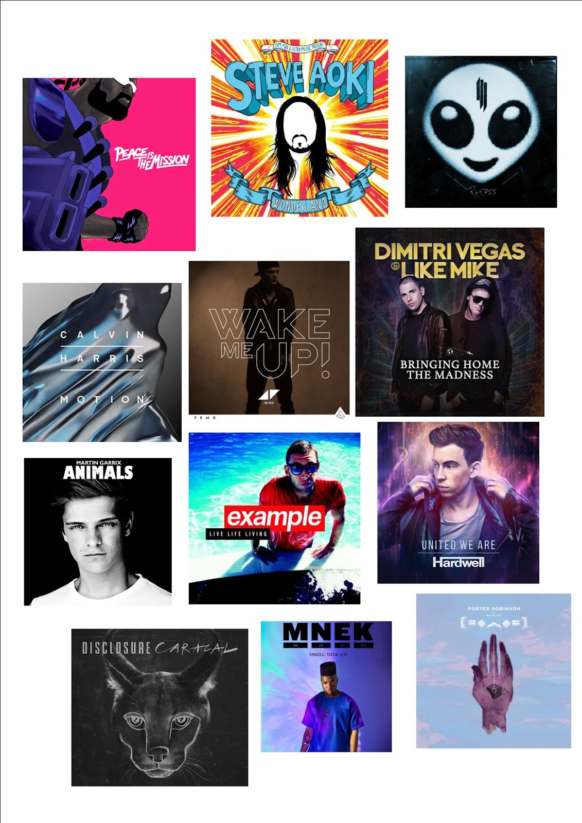
After looking at some album covers, I collated a range of EDM albums together into a album cover collage.
Album Cover Collage
The album covers don't seem to differ a whole load with 2 main concepts:
A focal picture of the artist (either cartoon or real)
A concept piece e.g. Calvin Harris' album which doesn't feature the artist
The artist name is on the front on the majority of the albums and for all of the ones that don't feature a name, it is both not their debut album and also features a recognisable photo of the artist.
Major Lazer's album
The colour schemes tend be simpistic with a focus on just a few colours and in some instances just a block colour background.
The font for the artist name is usually the most striking font and the album title almost always uses a different font. This creates a clear difference between who the artist is and what the album is called. There is usually little text on the front cover leaving the the focal image to bring in the attention of the consumer.
Martin Garrix's album
Animals by Martin Garrix
This album follows almost all of the conventions I've found in EDM album covers. It features a large focal image of the DJ which catches the eye immediately. The text is all located at the top leaving the focal image largely undisturbed. The 2 fonts for the artist and album title are different but both bold and likely to draw the consumer's eye after they see the photo of Martin Garrix.
Calvin Harris' album
Motion by Calvin Harris
This album also follows most conventions. It is a conceptual album cover with a focal image of a drop of water. To make up for the lack of image of the artist, Calvin Harris' name is underlined in the centre of the album cover drawing the eye of the consumer to this. The title of the album is featured in the same font as the artist's name which is rare but this may be explained by the fact that it isn't underlined therefore leaving no doubt where the artist name ends and the album name begins.
This music video is a great example of character progression, the 2 boys who start of as really timid and scared end the video as having accepted and found their true selves as connoted by the white light emitted from their hands.
Possible intertextuality with typical Northern town setting similar to Billy Elliot and the same concept of hiding passions due to backwards attitudes
Slow-paced edit at the start but faster towards the end highlighting the climax of the video and progress of the characters
Music Video
Music Video
A good example of Goodwin's theory as the lyrics talk about a girl but the visuals show boys. This is amplification as it adds a new layer to the song i.e. the lyrics are about a girl because they boys feel they have to hide their sexuality.
The music video is a narrative but the lead singer, Matt Healy, appears in the video anchoring the song to the band. There are a number of beauty shots also, a concept appearing in almost all music videos.
On a stylistic point, the music video is in black and white, this is certainly something we may consider if our song is of a genre that fits in with this style. The use of slow motion is also quite eye-catching, I feel this is something I'd like to put into our music video.
I suggested this song as I felt it'd be a really good choice due to the fact that it had so many notable changes in pace that we could utilise for many creative ideas e.g. Build-up, drop and then break. In addition to this, the song features lyrics meaning we can add some performance shots to a music video and also that we can market the song from the singer's point of view featuring a DJ rather than the other way round. Finally, the song doesn't have an official music video, only a lyric video, meaning our ideas wouldn't be influenced by the real music video.
Ummet Ozcan - Stars
Similar to the first choice, we felt this song featured notable changes in pace that we could use to put some creative ideas into our music video. However, the lead singer in this is a woman and therefore, we'd have to get someone from outside of our group to play this role which is a bit awkward as we have to schedule around it as they aren't always free at the same time as us and also haven't had the lip-sync training that we had from the prelim.
Felix Jaehn - Ain't Nobody
Eddie suggested this song and although we liked the song, we didn't like the fact that it already had a music video as some of our creative ideas may have been influenced, also, the lead singer is a girl which again brings up the same issues as we had for 'Stars'. Finally, the song has a very tropical feel to it meaning that it may be hard to create a tropical music video with the constraints of weather, living in England.
Spinnin' Records is a Dutch, independent record label founded in 1999. They deal with EDM so are obviously a record label of large interest to our group. They have 40 sub groups showing their stature and growing relevance in the EDM market. They have a wide range of clientele featuring both bigger and small names in the past and present such as Duke Dumont, Martin Garrix and Avicii.
The Big 3 In regards to the more general trend of record labels, the music industry is dominated by 3 record labels:
Universal Music Group - own 34.1% of the industry
Sony Music Entertainment - own 22.5% of the industry
Warner Music Group - own 16.7% of the industry
Between them, the companies take in 89% of global music sales representing a huge amount of the market.
These conglomerates also receive the majority of the profits as demonstrated by this post tax profit breakdown.


 I like the greenscreen effect that was used in the movie, 300. The film was heavily stylised which looked particularly eye-catching and provided a great overall style to the film.