

 |
| Album Cover Collage |
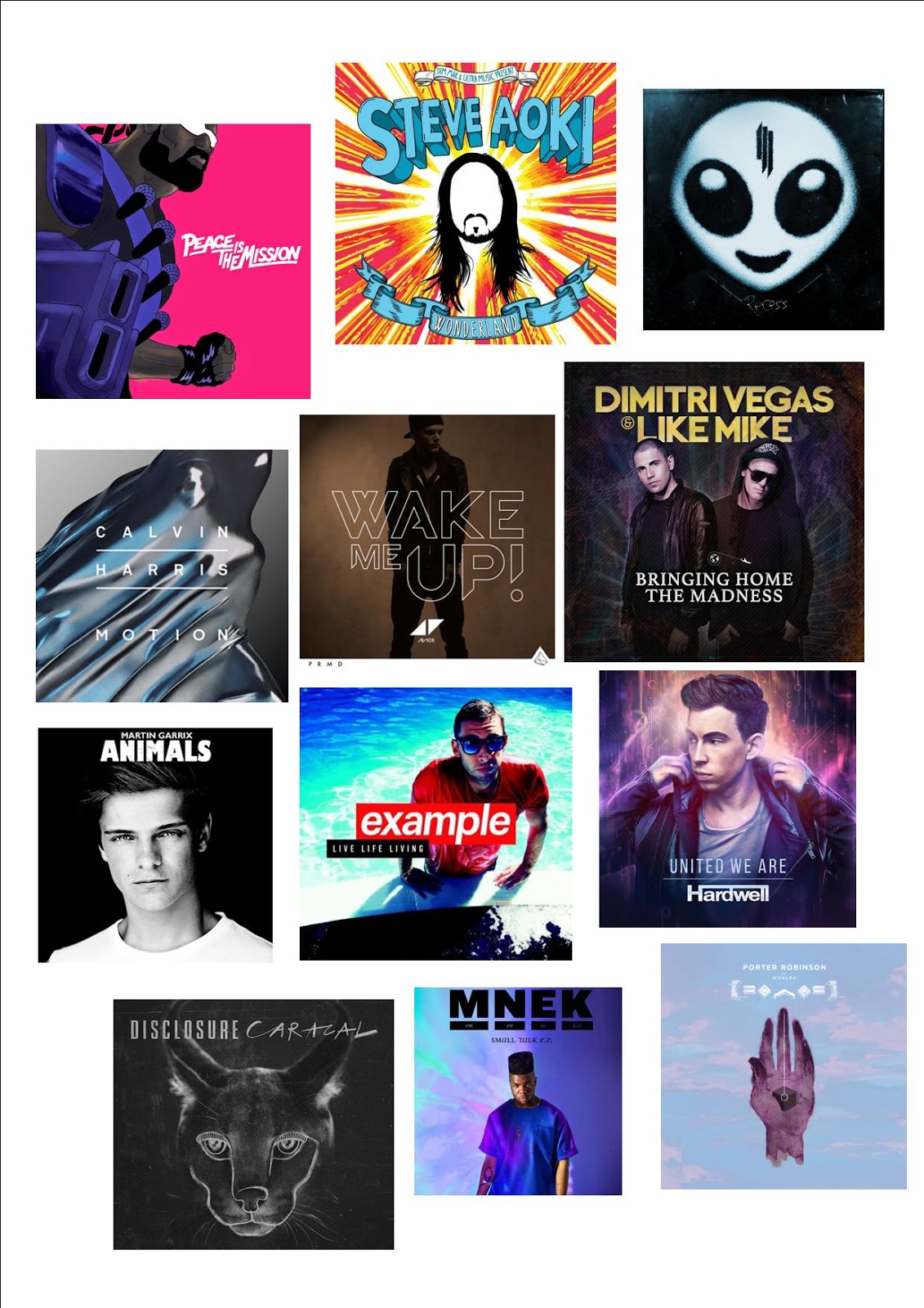
The album covers don't seem to differ a whole load with 2 main concepts:
- A focal picture of the artist (either cartoon or real)
- A concept piece e.g. Calvin Harris' album which doesn't feature the artist
The artist name is on the front on the majority of the albums and for all of the ones that don't feature a name, it is both not their debut album and also features a recognisable photo of the artist.
 |
| Major Lazer's album |
The colour schemes tend be simpistic with a focus on just a few colours and in some instances just a block colour background.
The font for the artist name is usually the most striking font and the album title almost always uses a different font. This creates a clear difference between who the artist is and what the album is called. There is usually little text on the front cover leaving the the focal image to bring in the attention of the consumer.
 |
| Martin Garrix's album |
Animals by Martin Garrix
This album follows almost all of the conventions I've found in EDM album covers. It features a large focal image of the DJ which catches the eye immediately. The text is all located at the top leaving the focal image largely undisturbed. The 2 fonts for the artist and album title are different but both bold and likely to draw the consumer's eye after they see the photo of Martin Garrix.
 |
| Calvin Harris' album |
Motion by Calvin Harris
This album also follows most conventions. It is a conceptual album cover with a focal image of a drop of water. To make up for the lack of image of the artist, Calvin Harris' name is underlined in the centre of the album cover drawing the eye of the consumer to this. The title of the album is featured in the same font as the artist's name which is rare but this may be explained by the fact that it isn't underlined therefore leaving no doubt where the artist name ends and the album name begins.
No comments:
Post a Comment